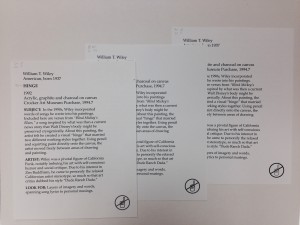
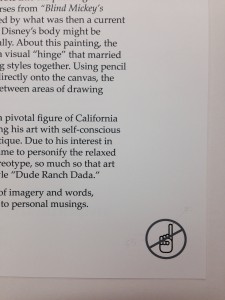
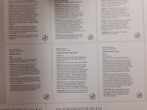
If you’ve seen it once, you’ve seen it a thousand times; Visitors molesting the objects without a care in the world. I’m sorry for the strong language here, but I can’t seem to get used to it after all these years, it’s so very frustrating. We are charged with protecting and caring for these works not just furor lifetime, but for generations; we’re custodians for the objects and we do what we can. Here are a couple of images from the Crocker Art Museum in Sacramento California. One illustrating how a completely reorganized permanent gallery has pushed the message more strongly. Each and every label has a do not touch symbol, but they stopped short of using red in the universal symbol for “do not” and kept the colors to charcoal and black. It’s subtle, but present and it avoids the issue where some objects have the special do not touch labels while others do not and visitors, some visitors, feel like they can touch the latter. Throughout this room and throughout the museum you’ll find these other “Touchy Subject” labels. I’d be interested to know how many people actually read these labels and of those people how many of them stopped themselves from touching because of it. But in the end, we put em up because if we reach one person and day, week, or moth, it’s that much better for the art. What do you use in your museum? Have you studies their efficacy? This image has three different combination of Black, Charcoal, and light grey. We chose the second image down:

This image has three different combination of Black, Charcoal, and light grey. We chose the next image:


You must be logged in to post a comment.